
Monday, September 17, 2012
Draw the Art
Inspired by a quote from the book "Steal Like An Artist" by Austin Kleon. A good read. Recommended.

Sunday, September 9, 2012
Creative Workshop Exercize 8: Spray Paint Wars
The Challenge: Come up with a name for a new clothing company whose work is inspired by street art, and design a logo in a graffiti style. Next create a storyboard for a video where your logo will be painted to be shown on a TV in the store. Time: 2 hours.
The company name: I came up with the company name "Hang Tag" which refers to the tags that are attached to retail clothing, and also refers to graffiti slang (at least from when I was "cool" - maybe they're calling it something besides "tagging" now).
Here's my storyboard:

With about 45 minutes to spare. I hope not to have as big a hiatus between posts going forward.
Friday, September 7, 2012
Steal Like an Artist
I just finished reading a very inspirational book, Steal Like an Artist: 10 Things Nobody Told You About Being Creative by Austin Kleon. It was just the kick in the pants that I needed right now.
I learned that I'm doing the right things to hone my skills.
I learned that I'm collecting and not hoarding, and made me feel a lot better about the sheer number of books and bits of this and that which have become my array of prized possessions.
I also figured out that the last 2 months of vegging in front of the TV was some needed downtime to let my brain recharge and I'm hoping that I'll become energized and productive in my after-the-day-job time again.
I highly recommend this book to anyone who aspires to accomplish things.
Monday, June 25, 2012
Day 25, Kaleidoscope #30DoC
Almost feels as if this is cheating, but an iPhone photo looking through a kaleidoscope that is an accessory in my hotel room.


Sunday, June 24, 2012
On The Road, Day 24 #30DoC
I'm traveling for business this week and I'm in Chicago. This evening, I sat on a rocking chair outside my hotel and sketched this as the sun was setting.
 |
The front porch rockers at the W Lakeshore, Chicago. 24 June 2012BONUS
I shaded "Pipes" from yesterday and added a gauge and a large valve. I like how it turned out.
 |
Saturday, June 23, 2012

Friday, June 22, 2012
Magic Mushrooms Day 22 #30DoC
Ink and watercolor pencil sketch. I'm very pleased the new sketchbook's paper is thick enough for me to use a wet brush on it to activate the pencil.


Thursday, June 21, 2012

Wednesday, June 20, 2012
Finger-painting Day 20 #30DoC
This was done on my iPad tablet using the 53 Paper app. I'm still getting the hang of the tools, and I think I might get better results with a stylus.


Tuesday, June 19, 2012
Cone of Shame No. 2 - #30DoC Day 19
 |
| Cat in a Cone |
Monday, June 18, 2012

Sunday, June 17, 2012
Flower Paisley Number 3, Day 17 #30DoC
Flower Paisley #3, Inked.

I'm breaking in a new "proper" Moleskine sketchbook - one with a paper that seems to be at lease three times heavier than the other Moleskine I've been using (that one is called a "Journal" and now I understand the difference between them). I like that the image on the other side of the page doesn't show through at all. I'm going to try a watercolor or wet ink wash on some pieces in this book, so stay tuned.
I also have to be a bit more careful about letting ink dry before resting my hand on an area to work somewhere else on the page.
Saturday, June 16, 2012

Friday, June 15, 2012
Cone of Shame, #30DoC Day 15
Inspired by a photo posted by one of my FaceBook friends.
 |
| The Cone of Shame, pen & ink |
Thursday, June 14, 2012
Eagle, 30 Days of Creativity, Day 14
Another pen and ink study for my totem pole project, which has languished far too long. This one is an eagle for the top of the pole.


Wednesday, June 13, 2012
Bear #30DoC Day 13
A pen and ink preliminary sketch for a cedar totem pole. This is the base figure, a Haida-style bear.


Tuesday, June 12, 2012

Monday, June 11, 2012
Between Red and Yellow, #30Doc Day11
The theme today is Orange, and I felt lazy so I didn't come up with my own theme for today. Here is my orange drawing of the day, a rather literal interpretation.
 |
| Between Red and Yellow, pen, ink, and pencil |

Saturday, June 9, 2012
Quilt block #30DoC Day 9

Friday, June 8, 2012
Graduation #1, 30DoC Day 8
Pen & Ink, started while waiting for an ice cream sundae at Friendly's Restaurant in Clark, NJ.


Thursday, June 7, 2012

Wednesday, June 6, 2012
Paisley, Day 6 30DoC
Pen an ink doodle, inspired by Zentangles®
 |
| pen & ink doodle, 30 Days of Creativity, day 6 |
Tuesday, June 5, 2012
Sol and Her Planets Mandala 30DoC Day 5
 |
| A sketchbook mandala composed of the astronomical symbols for the sun and the planets, with some additional whimsy thrown in. |
Monday, June 4, 2012
Denim Mandala, 30DoC Day 4
 |
| Denim Mandala, 30 Days of Creativity, day 4 |
Sunday, June 3, 2012
Rick, in 15 Minutes #30DoC Day 3
A quick pencil sketch from a photo of my husband. It's not perfect, but it's recognizable. I think I needed to warm up first. 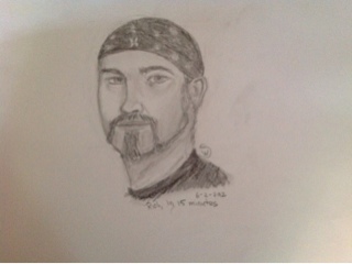
Saturday, June 2, 2012
Harlequin 30DoC Day 2
 |
| "final" colored-in version |
 |
| Inking done |
 |
| Pencil shading done |
Friday, June 1, 2012
Sketchbook cover, 30DoC Day 1
I am participating again in 30 Days of Creativity, which runs for the month of June. I'll be posting my work here and on (several) Pintrest boards, and making announcements via the various social networks of which I'm a member. If you want to see what I did last year, it's on this pinboard.
So, what do you do when you've got too many projects going on at the same time? You combine them!
Today, I created a cover for my Art House Co-op Sketchbook Project sketchbook.
I will probably add some additional shading in pencil or a shading markers and I'd like to put some highlights in as well. Maybe some dilute white acrylic. Not sure yet.
EDIT: I discovered over the weekend that I have a white watercolor pencil. Added highlights that way.:
If you are also participating in 30 Days of Creativity, please let me know in the comments here, and I'll follow you!
So, what do you do when you've got too many projects going on at the same time? You combine them!
Today, I created a cover for my Art House Co-op Sketchbook Project sketchbook.
 |
| Sketchbook Cover |
I will probably add some additional shading in pencil or a shading markers and I'd like to put some highlights in as well. Maybe some dilute white acrylic. Not sure yet.
EDIT: I discovered over the weekend that I have a white watercolor pencil. Added highlights that way.:
 |
| Sketchbook Cover, With Highlights. Pencil and ink. |
Wednesday, May 30, 2012
Mandalas (an interlude)
The other day, I was directed to this video by one of my FaceBook friends, and I've been dabbling with these mandalas for a couple of weeks now. This past Sunday, I had a lunch date with some dear friends that I hadn't seen in much too long, and I was the first to arrive at the restaurant. Since I had a few minutes to kill, and had my sketchbook and micron pens with me (as I do most days these days), I started drawing a mandala. I finished it at home in the evening. I call it "Lunch with Friends"

Today, I decided to try re-creating it in Illustrator, as a vector drawing.
 I like both of them, for different reasons. I will be pleased if I can manage to get a similar level of control as the woman in the video. The nice thing about the vector version is that I can play with coloring it in much more easily than the hand-drawn one.
Today, I decided to try re-creating it in Illustrator, as a vector drawing.

Monday, May 28, 2012
Challenge 07: Gridlocked
This challenge has to do with layout. I had 60 minutes to design an interior spread for an 11x17 (tabloid) brochure (folded to 8 1/2 x 11) for a juvenile diabetes treatment plan. Prior to the starting the clock, I was to come up with a name and logo for this thing.
The number of grids on the spread are determined by a random dice roll.
There are 6 required elements: 1 3" x 4" picture, 500 words of text (4-6 paragraphs), 100 words of "legal" (tiny type), 1 inset/pull quote (20 words) 1 8-word headline, and the logo, shown at least 1.25" wide.
Of course, I rolled a 1 on the die.
After this version is done, create a new version where the logo is at least 2" larger than it was before.
Then, re-roll the dice and add that many columns to the layout and re-design. I rolled a 4.
I went over time on this challenge, I blame my lack of expertise with InDesign. I am not completely in love with any of these layouts (or the name I came up for the treatment plan, but I am so ready to get past this assignment and move along to the next one). I used some stock photos from an old library I have from some even older software that's been sitting on my hard drive. I would have done more with color and "artistic elements" if I had more time. Every time I look at these, I see things I want to tweak and change. But this is what you get for 1 hour and 24 minutes worth of work.
The number of grids on the spread are determined by a random dice roll.
There are 6 required elements: 1 3" x 4" picture, 500 words of text (4-6 paragraphs), 100 words of "legal" (tiny type), 1 inset/pull quote (20 words) 1 8-word headline, and the logo, shown at least 1.25" wide.
Of course, I rolled a 1 on the die.
 |
| 1-column layut |
 |
| 1 column layout with larger logo |
 |
| 5-column layout. This one is my favorite. |
I went over time on this challenge, I blame my lack of expertise with InDesign. I am not completely in love with any of these layouts (or the name I came up for the treatment plan, but I am so ready to get past this assignment and move along to the next one). I used some stock photos from an old library I have from some even older software that's been sitting on my hard drive. I would have done more with color and "artistic elements" if I had more time. Every time I look at these, I see things I want to tweak and change. But this is what you get for 1 hour and 24 minutes worth of work.
Tuesday, May 15, 2012
Challenge 6: Blu
That hiatus was rather longer than I had planned - work and other projects got in the way. It had nothing to do with being blocked for ideas at all. Seriously. I mean, how hard could it be to come up with a concept for a magazine named "Blu" and then design the cover of the first issue? In an hour.

My Blu magazine is a fiction magazine, with some art and possibly some irony thrown in.
My Blu magazine is a fiction magazine, with some art and possibly some irony thrown in.
Wednesday, May 9, 2012
How to get More Hits on Your Blog
Post something about Bacon. Here is my Bacon Flowchart, version 1.0.

Please excuse me while I cook and eat some bacon.
Please excuse me while I cook and eat some bacon.
Wednesday, March 14, 2012
Interlude: New Sketchbook

Sunday, February 12, 2012
Challenge 5: I'm Drawing a Blank
In this challenge, I had 60 minutes to design a 9x12 folder for a paint company as part of a rebranding effort. The folder must have 90% white space showing in the overall design. What I have trouble with is calculating that 10% ink would look like. But I came up with this, produced in Adobe Illustrator:

If this were a real client and a real job, I'm sure it would go through several iterations before final approval. I find this particular challenge slightly amusing, since I just spent the last month working on a major rebranding effort at work, which included a 9x12 die cut folder.
This particular design uses a slightly modified paint brush icon from The Noun Project. I didn't spend time working up a company name or logo, using the paint brush as the de-facto company logo. At some point, my portfolio will get redone and I'll post the "real" folder that was sent to the printers' last week.
Sorry for the gap in posting. Lots of overtime at work, to get the rebranded collateral finished for an upcoming trade show, plus college financial aid application deadlines (prompting the completion of 2011 taxes) kept me from doing anything for myself for a couple of weeks.
Monday, January 30, 2012
Challenge 4: One Line Logo
This challenge is to create a logo for the London 2012 Olympics with only one line - in other words, do not lift your pen or pencil off the paper. The timer is set for 30 minutes. I finished with 10 minutes left to spare.
This actually dovetailed nicely with a drawing exercise we did in life drawing class 2 weeks ago.(which was to draw the mannikin without lifting the pencil). This time, the examples in the book stifled me a bit, because I didn't want to "copy" them, but I wound up riffing off the same theme anyway. I think I might have come up with something better if I knew the iconic buildings in London more than I do. I think a mock skyline drawing that also hinted at letterforms would work for me here. In any case, here are my results, in chronological order.
 on this page, I practiced making the number 2 as part of a continuous line, but I started to focus on a particular idea.
 The final version is a bit more literal than I would have liked, but it's a couple of years since the book has been published, the official London 2012 logo is out, and NBC has rejected that one for something else entirely in their TV ads that are starting to plaster the airwaves.

This actually dovetailed nicely with a drawing exercise we did in life drawing class 2 weeks ago.(which was to draw the mannikin without lifting the pencil). This time, the examples in the book stifled me a bit, because I didn't want to "copy" them, but I wound up riffing off the same theme anyway. I think I might have come up with something better if I knew the iconic buildings in London more than I do. I think a mock skyline drawing that also hinted at letterforms would work for me here. In any case, here are my results, in chronological order.
Friday, January 20, 2012
Challenge 3: Time Machine
This 90-minute challenge requires that you find a print ad from before 1980 and redesign it into a contemporary ad for a full-page color spread in one of these magazines: Wired, Better Homes & Gardens, O: the Oprah Magazine, Dwell, GQ, Vanity,or US Weekly. In other words, none of the magazines I ever read.
I also recently (as in the last 2 years) purged the house of every magazine older than 1 year old. I did manage to dig up a National Lampoon from the mid-70's, but all the ads were for cigarettes, cars, booze, condoms, or stereo equipment. A big fat MEH.
So I did a little poking around online and found this lovely, whimsical ad from 1888:
 Which I proceeded to "modernize" and by modernize, I mean crush its soul, and remove any hint of subtlety. think I've made a statement on the state of how we market things to people 130 years into the future.

I also recently (as in the last 2 years) purged the house of every magazine older than 1 year old. I did manage to dig up a National Lampoon from the mid-70's, but all the ads were for cigarettes, cars, booze, condoms, or stereo equipment. A big fat MEH.
So I did a little poking around online and found this lovely, whimsical ad from 1888:


Sunday, January 15, 2012
Challenge 2:Easy As ABC
Today's challenge was to design typography using only found object or environments around you. Time limit 120 minutes. I will meet the time limit including posting this blog entry. I read the instructions before I went to bed last night (and woke up with ideas for tweaking the logo design from yesterday's challenge). So when I was brushing my teeth this morning, I realized that the faucet with the water running plus the valve handle at just the right angle formed a letter A, and I decided to find the objects in my bedroom (which includes the Master Bathroom).

For those that are curious:
A: Bathroom faucet
B: 2 Dixie Cups
C: Philodendron
D: Toilet Paper holder
E: Rocking Chair
F: Jewlery box with 2 drawers removed
G: Headphones (needed the book between them to hold the earpieces apart)
H: Bed frame
I: Bed Frame (different angle)
J: Tub faucet (upside down)
K: Plumbing access panel with knob, and cord used to hang a quilt on the wall
L: Edge of the stairway partial wall
M: 3-prong plug
N: Books (I realized at this point that I could do an entire alphabet with just books, but... time limits)
O: Make-up Mirror
P: Handlebar for my treadmill
Q: Crystal bowl with handle
R: Bathroom sink cold water valve handle
S: Pair of boots and a slipper
T: Bed frame
U: Books
V: More Books
W: Even More Books
X: keyboard bench
Y: 2-prong plug
Z: Yoga mats and yoga blocks
Punctuation: a pair of dirty socks left on the floor
Photos taken with my iPhone 4, and cropped and collaged in Photoshop.
And... Time.
I will probably be doing these exercises on the weekends and not every day. I don't think I have the time in my schedule to do these every single day for the next 80 days. But doing 2 a week will take most of the year as it is.
Saturday, January 14, 2012
Challenge 1: Hello, My Name Is
All the challenges in the Creative Workshop are time-constrained. This is because, as author David Sherwin aptly points out, all your paid design work will be under a tight deadline. As I come off of 2 weeks of "we need a cut sheet for this product in 2 hours" at work, I can completely testify to the accuracy of this statement. I know this applies to all sorts of work, every writing assignment, every programming job, every huge engineering project I've been a part of - we never seem to have quite enough time to do it the way we would have liked. There is always pressure to get it done faster. So I really appreciate where the author is coming from, and I appreciate having to practice being creative "on demand" without my job being in the balance, so when my job is on the line, I don't have to actually panic to perform when the office is in panic mode.
Creative Workshop
I purchased the book Creative Workshop, 80 Challenges to sharpen your design skills by David Sherwin, and it showed up at my door this morning. I'm already in love with it.
I will be showing off the results of my work as I progress through this book. I also invite any of my readers who are designers (or aspiring designers) to work along with me, because it's more fun to do things as a group than by yourself. I also find that having people to be accountable to helps keep me focused and on track.
My next post will be to show off the results of lesson 1... Stay tuned.
Not Another Blog!
This might "dilute" my "readership" (all dozen of so of you so far), but I decided to blog about design in a separate blog from my quilting and music pursuits. So from now on, when I discuss any graphic design or art that involves anything except fiber, I'll be posting about it here.
The blog address "Wendyest.blogspot.com" was chosen because I'm the wendyest wendy, and enough permutations of "wendydesigns" were already taken and I didn't want an even longer URL.
The blog address "Wendyest.blogspot.com" was chosen because I'm the wendyest wendy, and enough permutations of "wendydesigns" were already taken and I didn't want an even longer URL.
Subscribe to:
Posts (Atom)